November 21, 2025
6
min read
Introduction
Launching a new icon library is always exciting, but launching something that truly solves a real design problem feels different. Sublima Icons is created for every UI/UX designer, product designer, web designer, and developer who wants clean, flexible, modern, and scalable icons ready for real projects.
In today’s design workflow, icons play a huge role in usability. They guide users, create visual hierarchy, and make interfaces feel intuitive. But finding a consistent, well-designed and production-ready icon set is still difficult.
That’s exactly why Sublima Icons exists.
The need for a consistent figma icon library
Designers often struggle with icons from multiple sources. They look different, follow different stroke widths, and break the overall design system. A consistent icon library can instantly improve the visual quality of any product.
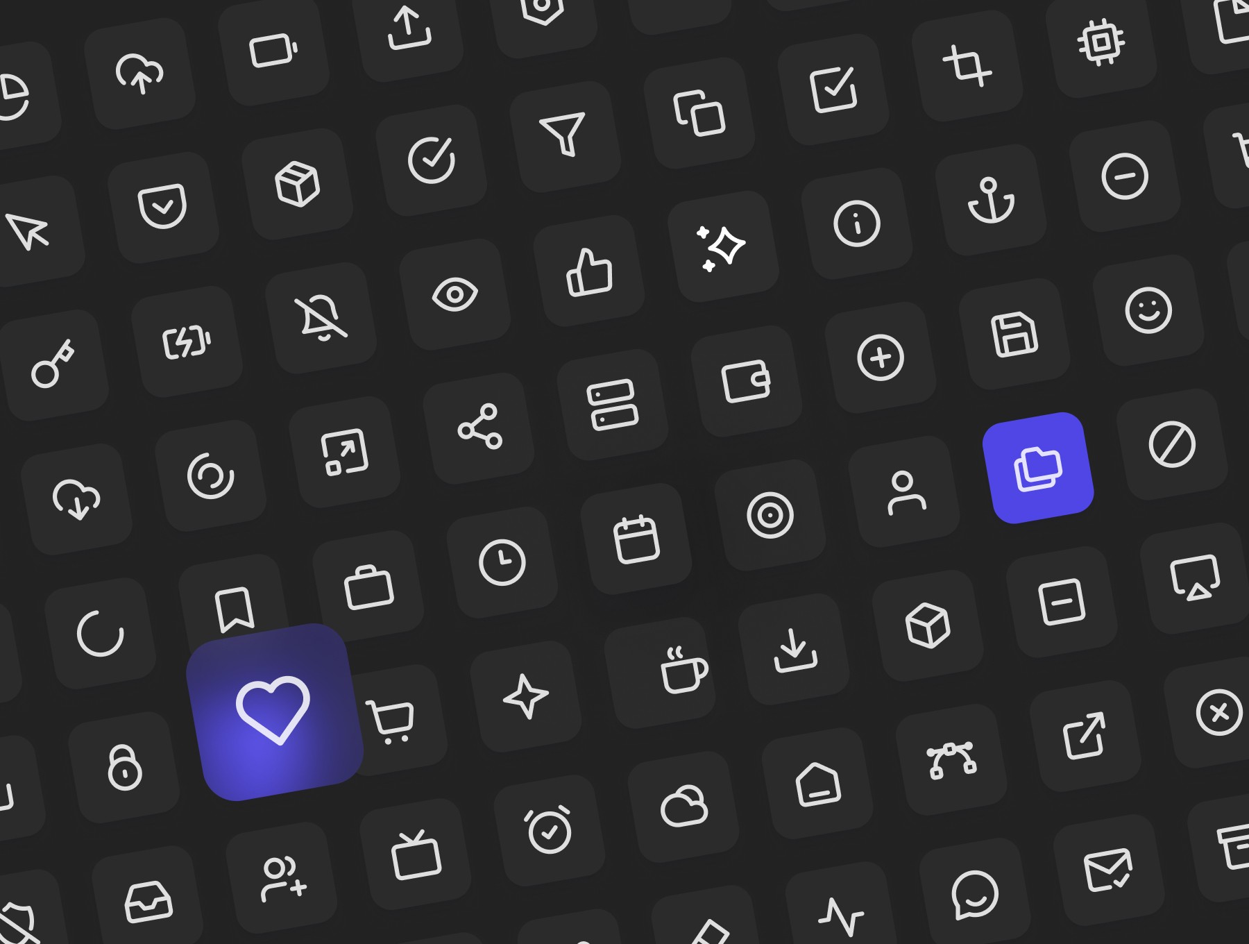
Sublima Icons is built on a clean 24×24 grid, with pixel-perfect alignment, ensuring every icon feels uniform across an entire design system. Whether you're working on mobile apps, dashboards, SaaS apps, or websites, the icons adapt beautifully.
What makes sublima icons different
Unlike generic free icon sets, this library focuses on professional design workflow, UI consistency, and Figma readiness.
Here’s what makes it special:
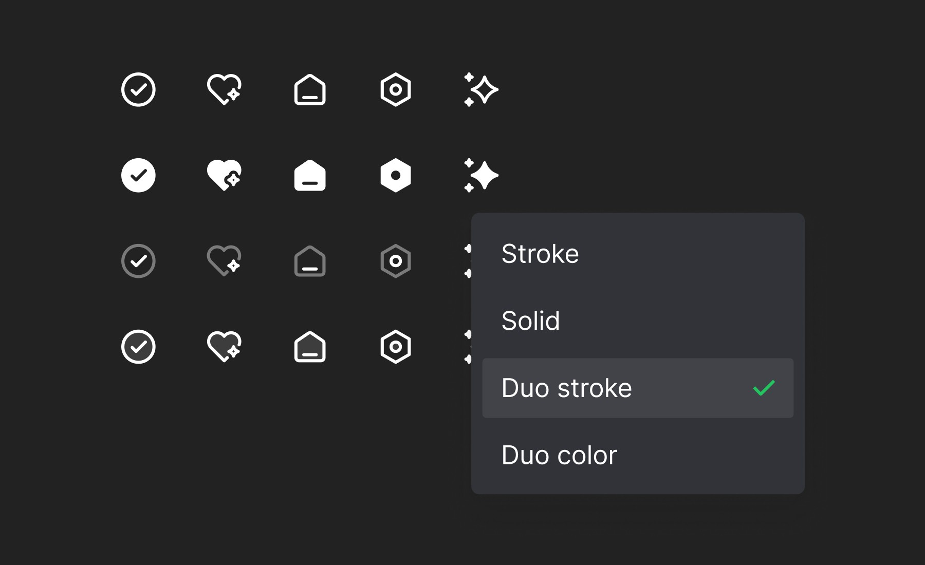
• 3000+ icons in 4 styles — Stroke, Solid, Duo Stroke, Duo Color
• Fully optimised for Figma design systems
• Perfect geometry & consistent stroke thickness
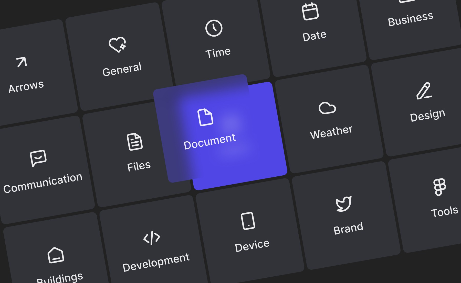
• Popular categories for quick navigation
• Plug-and-play usage for any UI design
• Scalable for light mode + dark mode
• Ideal for websites, apps, dashboards & wireframes
This makes it not just an icon pack, but a design-system-ready icon library.
How these icons improve ui quality
When icons look consistent, the whole product feels premium. Visual rhythm improves. Buttons and navigation feel balanced. Users understand interactions faster.
Designers spend less time fixing alignment, resizing icons, or adjusting stroke thickness. With Sublima Icons, you simply drag & drop into your Figma project and continue designing.
That saves time. That increases productivity. And that elevates the overall user experience.
Built for modern ui/ux designers
Whether you're using Figma, building a design system, or working with component libraries, Sublima Icons fits seamlessly into every workflow.
This icon set supports:
• Web design
• UI/UX projects
• Mobile app interfaces
• Product dashboards
• SaaS tools
• E-commerce websites
• Developer handoff
• Brand design systems
Its versatility makes it a long-term asset for designers who work on multiple projects.
A valuable tool for your next design system
Design systems are becoming the backbone of product teams. A well-crafted icon library is a core element inside every system. Sublima Icons provides that foundation with four beautiful styles, making it easier to maintain a unified visual language.
This makes the icon pack not just a resource, but a crucial building block of your Figma workflow.
Download sublima icons
If you’re a designer looking to upgrade your UI quality, you can get Sublima Icons and start using all 3000+ icons in your next project.
It’s crafted to save time, improve clarity, and give your designs a professional, system-driven look.
Download Sublima Icons
Conclusion
Sublima Icons isn’t just another icon pack — it’s a complete, design-system-ready solution for every modern UI/UX designer. With over 3000+ icons crafted on a consistent 24×24 grid, four versatile styles, and seamless Figma integration, it gives you everything you need to build cleaner interfaces, faster workflows and more polished digital products. Whether you’re designing mobile apps, dashboards or full-scale web platforms, this icon library brings clarity, balance and a premium feel to every layout.


