Creating a UI design system is pivotal for maintaining consistency, efficiency, and scalability in your design and development processes. This guide delves into the essential components of a robust UI design system and explains each point in detail, ensuring you have a comprehensive understanding to build or improve your own.
Introduction to UI design systems
A UI design system is a collection of reusable components, guided by clear standards, that can be assembled together to build any number of applications. It acts as a single source of truth for designers and developers, ensuring consistency across all products and platforms.
Foundational principles
Consistency
Consistency is the cornerstone of any design system. It ensures that all components look and behave uniformly across different platforms and contexts. This not only enhances user experience but also reinforces brand identity. Consistent UI elements help users to learn and adapt quickly, reducing the cognitive load and improving overall usability.
Scalability
A well-constructed design system scales effortlessly as your product grows. By utilizing reusable components, you can efficiently manage and implement updates across various interfaces without redundancy. Scalability ensures that as new features are added or new platforms are supported, the design remains coherent and manageable.
Efficiency
Design systems streamline the design and development process, reducing the time spent on creating new components. This efficiency translates to faster project completion and quicker iterations, allowing teams to focus on innovation and problem-solving. By standardizing design patterns and components, teams can avoid reinventing the wheel and reduce the risk of errors.
Core components of a UI design system
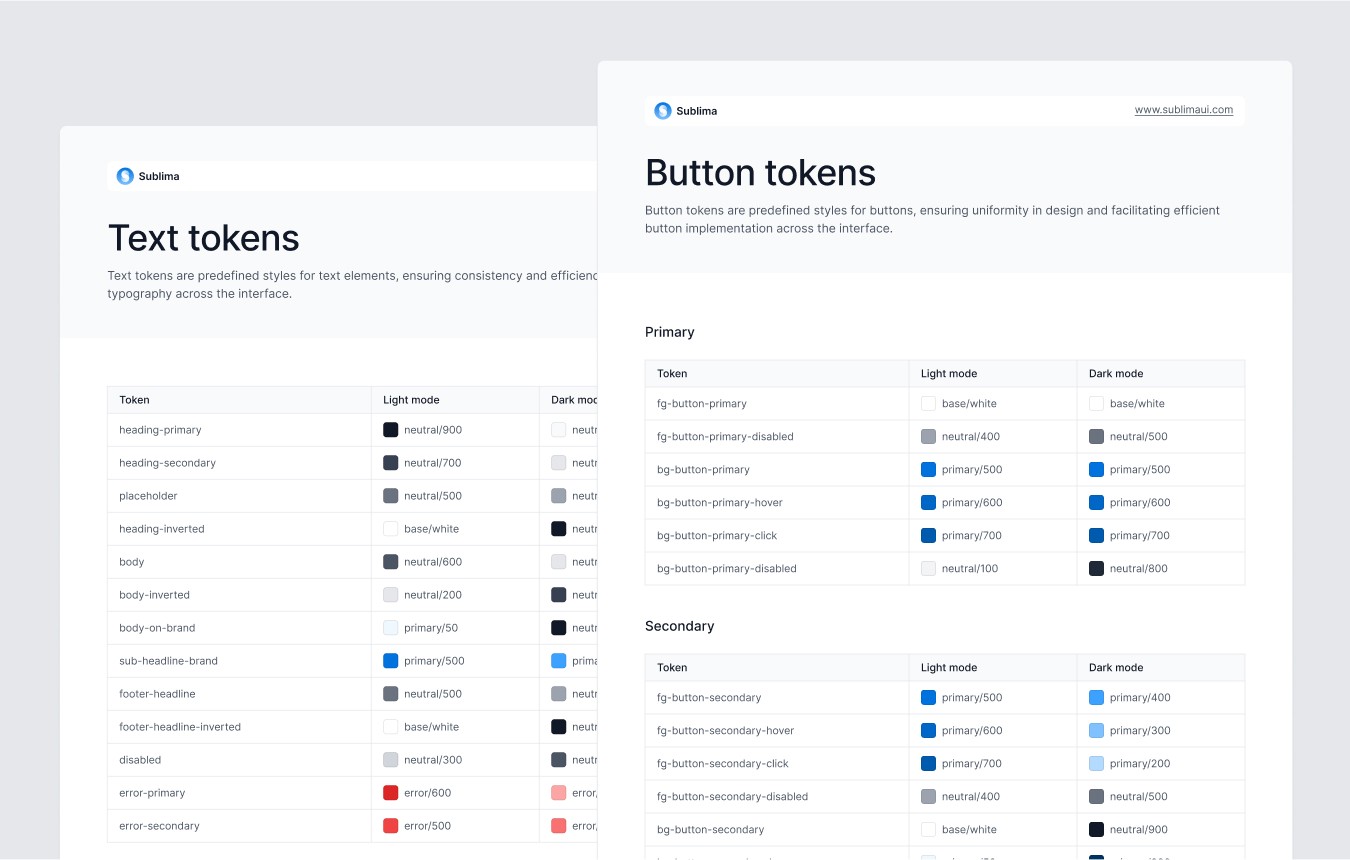
Design tokens
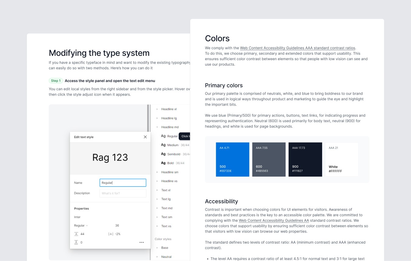
Design tokens are the smallest pieces of a design system. They represent values such as colors, fonts, spacing, and more. By using design tokens, you ensure that any change in these values is propagated across all components, maintaining consistency. For example, if the primary color changes, updating the design token will automatically update the color across all components using that token.
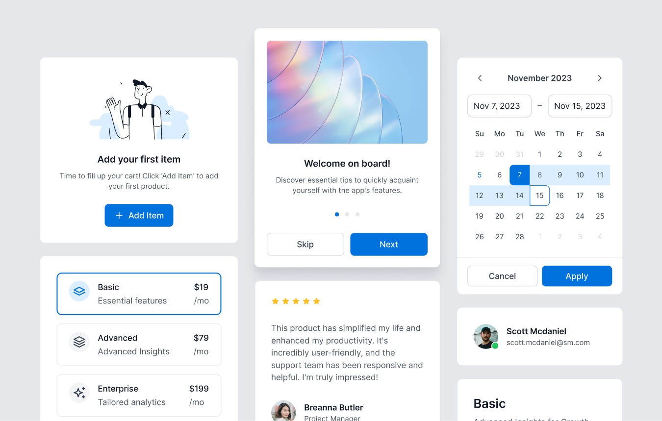
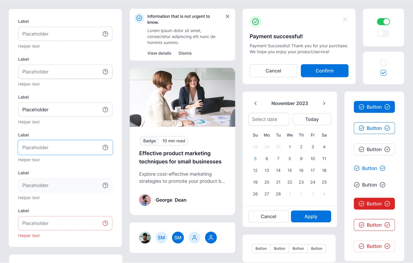
Component library
The component library is a collection of UI elements like buttons, forms, and navigation bars. Each component is designed to be reusable and adaptable, with clear guidelines on their usage and behavior. Components should be designed to be modular and flexible, allowing for customization while maintaining core functionality.
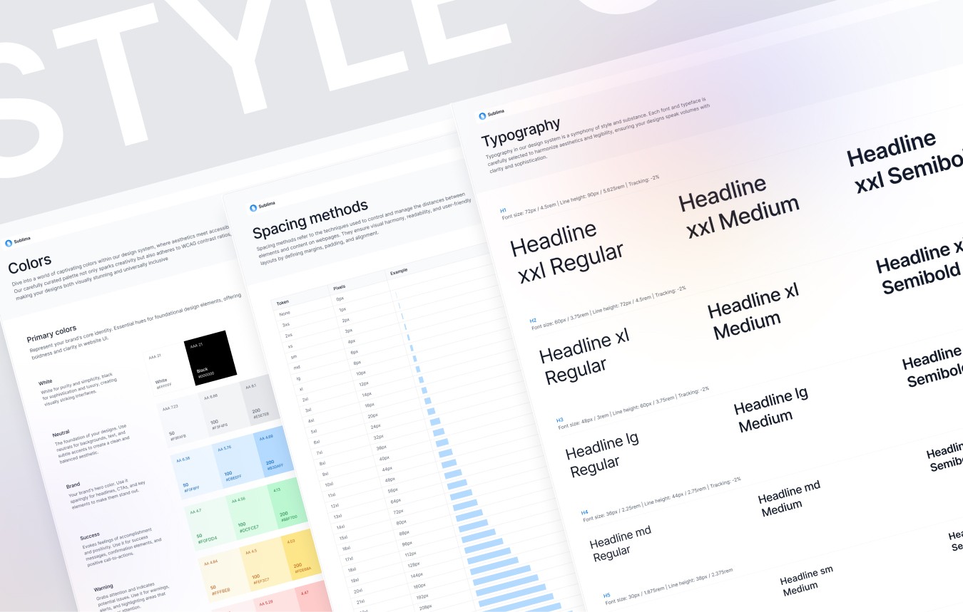
Style guide
The style guide outlines the visual and behavioral standards for the design system. It includes typography, color palettes, iconography, and interaction patterns. The style guide ensures that all elements adhere to the brand’s visual language. A well-documented style guide helps maintain visual coherence and makes it easier for new team members to get up to speed.
Documentation
Comprehensive documentation is crucial for the adoption and effective use of a design system. It includes usage guidelines, best practices, and code snippets, making it easier for designers and developers to implement the system correctly. Documentation should be accessible and regularly updated to reflect any changes or additions to the design system.
Building and maintaining your design system
Collaboration
Creating a design system is a collaborative effort involving designers, developers, and stakeholders. Regular communication and feedback loops ensure that the system evolves to meet the needs of all users. Collaboration tools and workshops can facilitate this process, ensuring all perspectives are considered.
Version control
Implementing version control allows you to manage changes and updates systematically. It helps in tracking progress, reverting to previous versions if necessary, and maintaining a clear history of the system’s evolution. Using tools like Git for version control can help manage the lifecycle of the design system effectively.
Regular updates
A design system is a living document that needs regular updates to stay relevant. This includes adding new components, updating existing ones, and refining guidelines based on user feedback and technological advancements. Regular audits and reviews ensure the design system evolves with the product and user needs.
Best practices for implementing a design system
Start small
Begin with the most crucial components and gradually expand your design system. This iterative approach allows you to manage complexity and ensures each part of the system is thoroughly tested and refined. Starting small also helps in gaining quick wins and demonstrating the value of the design system to stakeholders.
User-centered design
Always keep the end-user in mind. The design system should enhance usability and accessibility, providing a seamless experience across all touchpoints. Conducting user research and usability testing can provide valuable insights into how users interact with your components and identify areas for improvement.
Scalability in mind
Design your system to accommodate growth. As your product evolves, the design system should be able to support new requirements without significant overhauls. Designing components to be flexible and adaptable ensures they can meet future needs without major rework.
Feedback loop
Create mechanisms for ongoing feedback from your team and end-users. This input is invaluable for continuous improvement and ensuring the design system meets real-world needs. Regularly scheduled feedback sessions and user testing can help identify pain points and opportunities for enhancement.
Case studies and examples
Examining successful design systems from leading companies can provide valuable insights. For instance:
Google’s Material Design: Material Design emphasizes simplicity and usability, providing a comprehensive set of guidelines and components that ensure consistency across various platforms.
IBM’s Carbon Design System: Carbon Design System is known for its robust documentation and flexible components, making it adaptable to a wide range of applications.
Atlassian’s Design System: Atlassian focuses on clear communication and collaboration, with tools and guidelines that support their wide range of products.
Explore the latest premium UI kit, packed with all the essentials for designers. Start today and unleash your creativity!
Introduction to UI design systems
A UI design system is a collection of reusable components, guided by clear standards, that can be assembled together to build any number of applications. It acts as a single source of truth for designers and developers, ensuring consistency across all products and platforms.
Foundational principles
Consistency
Consistency is the cornerstone of any design system. It ensures that all components look and behave uniformly across different platforms and contexts. This not only enhances user experience but also reinforces brand identity. Consistent UI elements help users to learn and adapt quickly, reducing the cognitive load and improving overall usability.
Scalability
A well-constructed design system scales effortlessly as your product grows. By utilizing reusable components, you can efficiently manage and implement updates across various interfaces without redundancy. Scalability ensures that as new features are added or new platforms are supported, the design remains coherent and manageable.
Efficiency
Design systems streamline the design and development process, reducing the time spent on creating new components. This efficiency translates to faster project completion and quicker iterations, allowing teams to focus on innovation and problem-solving. By standardizing design patterns and components, teams can avoid reinventing the wheel and reduce the risk of errors.
Core components of a UI design system
Design tokens
Design tokens are the smallest pieces of a design system. They represent values such as colors, fonts, spacing, and more. By using design tokens, you ensure that any change in these values is propagated across all components, maintaining consistency. For example, if the primary color changes, updating the design token will automatically update the color across all components using that token.
Component library
The component library is a collection of UI elements like buttons, forms, and navigation bars. Each component is designed to be reusable and adaptable, with clear guidelines on their usage and behavior. Components should be designed to be modular and flexible, allowing for customization while maintaining core functionality.
Style guide
The style guide outlines the visual and behavioral standards for the design system. It includes typography, color palettes, iconography, and interaction patterns. The style guide ensures that all elements adhere to the brand’s visual language. A well-documented style guide helps maintain visual coherence and makes it easier for new team members to get up to speed.
Documentation
Comprehensive documentation is crucial for the adoption and effective use of a design system. It includes usage guidelines, best practices, and code snippets, making it easier for designers and developers to implement the system correctly. Documentation should be accessible and regularly updated to reflect any changes or additions to the design system.
Building and maintaining your design system
Collaboration
Creating a design system is a collaborative effort involving designers, developers, and stakeholders. Regular communication and feedback loops ensure that the system evolves to meet the needs of all users. Collaboration tools and workshops can facilitate this process, ensuring all perspectives are considered.
Version control
Implementing version control allows you to manage changes and updates systematically. It helps in tracking progress, reverting to previous versions if necessary, and maintaining a clear history of the system’s evolution. Using tools like Git for version control can help manage the lifecycle of the design system effectively.
Regular updates
A design system is a living document that needs regular updates to stay relevant. This includes adding new components, updating existing ones, and refining guidelines based on user feedback and technological advancements. Regular audits and reviews ensure the design system evolves with the product and user needs.
Best practices for implementing a design system
Start small
Begin with the most crucial components and gradually expand your design system. This iterative approach allows you to manage complexity and ensures each part of the system is thoroughly tested and refined. Starting small also helps in gaining quick wins and demonstrating the value of the design system to stakeholders.
User-centered design
Always keep the end-user in mind. The design system should enhance usability and accessibility, providing a seamless experience across all touchpoints. Conducting user research and usability testing can provide valuable insights into how users interact with your components and identify areas for improvement.
Scalability in mind
Design your system to accommodate growth. As your product evolves, the design system should be able to support new requirements without significant overhauls. Designing components to be flexible and adaptable ensures they can meet future needs without major rework.
Feedback loop
Create mechanisms for ongoing feedback from your team and end-users. This input is invaluable for continuous improvement and ensuring the design system meets real-world needs. Regularly scheduled feedback sessions and user testing can help identify pain points and opportunities for enhancement.
Case studies and examples
Examining successful design systems from leading companies can provide valuable insights. For instance:
Google’s Material Design: Material Design emphasizes simplicity and usability, providing a comprehensive set of guidelines and components that ensure consistency across various platforms.
IBM’s Carbon Design System: Carbon Design System is known for its robust documentation and flexible components, making it adaptable to a wide range of applications.
Atlassian’s Design System: Atlassian focuses on clear communication and collaboration, with tools and guidelines that support their wide range of products.
Explore the latest premium UI kit, packed with all the essentials for designers. Start today and unleash your creativity!
Conclusion
A robust UI design system is essential for creating cohesive, scalable, and efficient digital products. By focusing on consistency, scalability, and efficiency, and by integrating components such as design tokens, component libraries, and comprehensive documentation, you can build a design system that serves as a solid foundation for your design and development efforts.

Related Blogs
Related Blogs
Related Blogs
Related Blogs
Our latest news and articles


Get Sublima UI Today & Elevate Your Design Skills
Dive into our collection of pre-built UI components and landing page layouts to streamline your workflow and craft remarkable, professional designs in no time.
© 2024 Sublima. All rights reserved.
Get Sublima UI Today & Elevate Your Design Skills
Dive into our collection of pre-built UI components and landing page layouts to streamline your workflow and craft remarkable, professional designs in no time.
© 2024 Sublima. All rights reserved.
Get Sublima UI Today & Elevate Your Design Skills
Dive into our collection of pre-built UI components and landing page layouts to streamline your workflow and craft remarkable, professional designs in no time.
© 2024 Sublima. All rights reserved.
Get Sublima UI Today & Elevate Your Design Skills
Dive into our collection of pre-built UI components and landing page layouts to streamline your workflow and craft remarkable, professional designs in no time.
© 2024 Sublima. All rights reserved.