Introduction
In a world overflowing with information and complex interfaces, the value of minimalistic UI design has become increasingly evident. Minimalism in UI design focuses on simplicity, usability, and elegance, stripping away excess to ensure that every element serves a purpose. This design philosophy emphasizes a clean and functional interface that provides users with a seamless experience.
In this blog post, we’ll dive deep into the principles of minimalistic UI design, explore its benefits, and provide actionable tips to implement it in your projects. Whether you're looking to refresh an existing design or start from scratch, understanding minimalism can transform your UI and improve user engagement.

What is minimalistic UI design?
Minimalistic UI design is an approach that simplifies the interface by removing unnecessary elements, focusing only on essential functions and content. It’s not just about using fewer components; it’s about creating a purposeful and focused design that enhances the user experience by reducing distractions.
The minimalist design trend became popular in the early 2000s and continues to dominate many modern applications, websites, and digital products. Its clean aesthetic and user-centered philosophy create an environment where users can interact with a product effortlessly.
Core principles of minimalistic UI design
Focus on essential elements
In minimalistic design, every element on the screen should serve a clear purpose. Irrelevant graphics, redundant text, and unnecessary animations are removed, leaving only what is essential for the user. This approach streamlines navigation and helps users focus on tasks without confusion or visual clutter.
Whitespace is key
Whitespace, or negative space, is a critical component of minimalistic UI design. It refers to the empty space around elements and is used to create balance and breathing room for content. The effective use of whitespace guides the user’s attention to important areas of the page, making it easier to digest information and interact with the interface.
Simple and clear typography
Typography in minimalism plays a crucial role. Clear, legible fonts with straightforward formatting enhance readability and ensure the text is easy to scan. In minimalistic designs, designers often rely on one or two fonts, using variations in weight and size to establish hierarchy and emphasis.
Limited color palette
Minimalistic UI design typically uses a restrained color palette, often sticking to just a few colors to maintain simplicity. This doesn’t mean the design lacks vibrancy—it’s about using colors thoughtfully to create contrast and draw attention to key elements. Neutral tones with accent colors are common choices in minimalist design.
Intentional use of icons and visuals
In minimalistic design, icons and visuals are used sparingly but purposefully. Instead of decorative images, every visual element must serve a functional role, such as guiding the user or highlighting essential actions. Icons are often simplified and align with the overall clean aesthetic of the design.

Why minimalistic UI design is effective
Improved user experience
The simplicity of minimalistic UI design enhances the user experience by reducing cognitive load. Users can focus on completing their tasks without being overwhelmed by excessive information. Clear navigation, intuitive layout, and concise content make it easy for users to interact with the interface.
Faster load times
Minimalist designs tend to be lightweight, with fewer elements to load. This translates into faster load times, especially for mobile devices, where speed is crucial. Reducing heavy graphics, animations, and extra content improves performance and provides a smoother user experience.
Better accessibility
Minimalistic designs often prioritize legibility, clarity, and simplicity, which can enhance accessibility. Fewer distractions, clear text, and well-defined visual hierarchy help users with disabilities or impairments navigate the interface more easily.
Scalability and adaptability
Minimalistic UI design is highly adaptable across various devices and screen sizes. The simple layout and clean structure make it easy to scale designs from mobile phones to large desktop screens without compromising usability or aesthetics.
Long-lasting design trend
Minimalism is a timeless design approach. While other trends may come and go, minimalistic UI design remains relevant because of its clean and functional nature. It is adaptable to new design trends and technologies, making it a solid long-term strategy for any digital product.

How to implement minimalistic UI design
Start with a clear structure
Begin by creating a clear, organized structure. Outline the essential content and actions for your design, and remove anything that doesn’t directly contribute to the user’s experience. Use grids and layouts to maintain order and alignment, ensuring every element has a purpose.
Prioritize content hierarchy
When using minimalism, content hierarchy becomes even more important. Use typography, color, and layout to guide users through the interface. Headings should be easy to distinguish, and interactive elements should be prominent to create a smooth flow for users.
Leverage whitespace
Whitespace is your friend in minimalistic design. Don’t be afraid to leave empty space between elements, as it enhances focus and readability. Proper use of whitespace can create a sense of calm and organization, which is key in a minimalist interface.
Use simple and functional icons
Choose simple, universally recognized icons that clearly communicate their function. Ensure that your icons align with the overall tone of your design, avoiding overly complex or decorative visuals that could detract from the minimalist aesthetic.
Limit color and typography choices
Stick to a limited color palette, focusing on neutral tones and a few accent colors to draw attention where needed. Choose no more than two typefaces and use size and weight variations to establish visual hierarchy.
Best practices for minimalistic UI design
Balance simplicity with functionality
While minimalism is about reducing excess, it’s important to maintain a balance. Don’t sacrifice necessary functionality for the sake of simplicity. Ensure that users can still easily access key features and complete tasks without confusion.
Keep navigation intuitive
A minimalistic interface should have intuitive navigation that users can grasp immediately. Use straightforward menus and buttons, and avoid adding unnecessary steps or interactions.
Test and iterate
Minimalistic designs require refinement. Continuously test your interface with users to ensure that the design is both functional and aesthetically pleasing. User feedback will help you identify areas where simplicity can improve usability or where additional clarity may be needed.
Common mistakes to avoid in minimalistic UI design
Over-simplifying
While the goal of minimalism is simplicity, over-simplification can lead to confusion. Make sure that key functionalities are not hidden or difficult to find, and that users can still achieve their goals without unnecessary effort.
Neglecting visual interest
Minimalism doesn’t mean boring. Avoid creating a flat, uninteresting design by adding subtle visual interest through textures, gradients, or minimal animations that enhance the user experience without cluttering the interface.
Ignoring user needs
Minimalism shouldn’t come at the expense of usability. Always design with your users in mind, ensuring that the interface remains functional, accessible, and easy to navigate.
How Sublima UI embraces minimalistic UI design
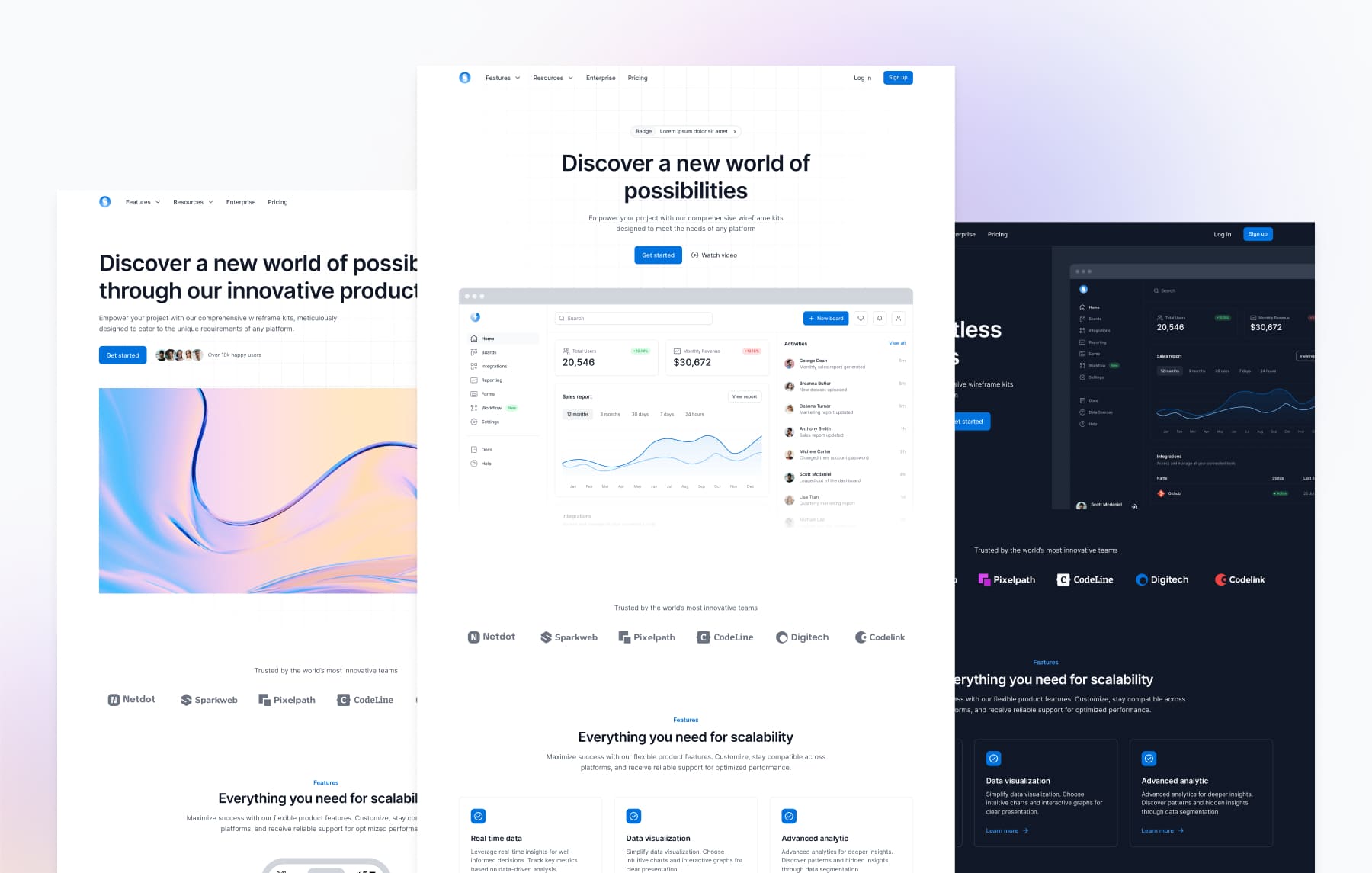
At Sublima UI, we recognize the value of minimalistic design in creating clean, user-friendly interfaces. Our UI kit is built around the principles of minimalism, offering pre-designed components that adhere to this aesthetic. With Sublima UI, you can easily implement a minimalist design approach while maintaining functionality and accessibility.
Sublima UI’s minimalistic features:
Clean and organized components: Our components are thoughtfully designed with simplicity and usability in mind. Each element serves a clear purpose, ensuring that your interface remains intuitive and easy to navigate.
Whitespace optimization: Sublima UI integrates whitespace effectively, allowing you to create layouts that are balanced and visually pleasing without overwhelming users.
Flexible design tokens: You can easily adjust typography, colors, and spacing while adhering to minimalist design principles. Sublima UI’s tokens offer flexibility while maintaining a clean and consistent aesthetic.
Why choose Sublima UI for minimalistic design?
Sublima UI makes it easy to adopt minimalistic design principles without sacrificing functionality. Whether you’re working on a mobile app, a website, or a dashboard, our kit provides the perfect foundation for creating streamlined, modern, and engaging user interfaces. With our pre-built components and design flexibility, you can build minimalist designs that enhance the user experience and scale effortlessly across devices.
What is minimalistic UI design?
Minimalistic UI design is an approach that simplifies the interface by removing unnecessary elements, focusing only on essential functions and content. It’s not just about using fewer components; it’s about creating a purposeful and focused design that enhances the user experience by reducing distractions.
The minimalist design trend became popular in the early 2000s and continues to dominate many modern applications, websites, and digital products. Its clean aesthetic and user-centered philosophy create an environment where users can interact with a product effortlessly.
Core principles of minimalistic UI design
Focus on essential elements
In minimalistic design, every element on the screen should serve a clear purpose. Irrelevant graphics, redundant text, and unnecessary animations are removed, leaving only what is essential for the user. This approach streamlines navigation and helps users focus on tasks without confusion or visual clutter.
Whitespace is key
Whitespace, or negative space, is a critical component of minimalistic UI design. It refers to the empty space around elements and is used to create balance and breathing room for content. The effective use of whitespace guides the user’s attention to important areas of the page, making it easier to digest information and interact with the interface.
Simple and clear typography
Typography in minimalism plays a crucial role. Clear, legible fonts with straightforward formatting enhance readability and ensure the text is easy to scan. In minimalistic designs, designers often rely on one or two fonts, using variations in weight and size to establish hierarchy and emphasis.
Limited color palette
Minimalistic UI design typically uses a restrained color palette, often sticking to just a few colors to maintain simplicity. This doesn’t mean the design lacks vibrancy—it’s about using colors thoughtfully to create contrast and draw attention to key elements. Neutral tones with accent colors are common choices in minimalist design.
Intentional use of icons and visuals
In minimalistic design, icons and visuals are used sparingly but purposefully. Instead of decorative images, every visual element must serve a functional role, such as guiding the user or highlighting essential actions. Icons are often simplified and align with the overall clean aesthetic of the design.
Why minimalistic UI design is effective
Improved user experience
The simplicity of minimalistic UI design enhances the user experience by reducing cognitive load. Users can focus on completing their tasks without being overwhelmed by excessive information. Clear navigation, intuitive layout, and concise content make it easy for users to interact with the interface.
Faster load times
Minimalist designs tend to be lightweight, with fewer elements to load. This translates into faster load times, especially for mobile devices, where speed is crucial. Reducing heavy graphics, animations, and extra content improves performance and provides a smoother user experience.
Better accessibility
Minimalistic designs often prioritize legibility, clarity, and simplicity, which can enhance accessibility. Fewer distractions, clear text, and well-defined visual hierarchy help users with disabilities or impairments navigate the interface more easily.
Scalability and adaptability
Minimalistic UI design is highly adaptable across various devices and screen sizes. The simple layout and clean structure make it easy to scale designs from mobile phones to large desktop screens without compromising usability or aesthetics.
Long-lasting design trend
Minimalism is a timeless design approach. While other trends may come and go, minimalistic UI design remains relevant because of its clean and functional nature. It is adaptable to new design trends and technologies, making it a solid long-term strategy for any digital product.
How to implement minimalistic UI design
Start with a clear structure
Begin by creating a clear, organized structure. Outline the essential content and actions for your design, and remove anything that doesn’t directly contribute to the user’s experience. Use grids and layouts to maintain order and alignment, ensuring every element has a purpose.
Prioritize content hierarchy
When using minimalism, content hierarchy becomes even more important. Use typography, color, and layout to guide users through the interface. Headings should be easy to distinguish, and interactive elements should be prominent to create a smooth flow for users.
Leverage whitespace
Whitespace is your friend in minimalistic design. Don’t be afraid to leave empty space between elements, as it enhances focus and readability. Proper use of whitespace can create a sense of calm and organization, which is key in a minimalist interface.
Use simple and functional icons
Choose simple, universally recognized icons that clearly communicate their function. Ensure that your icons align with the overall tone of your design, avoiding overly complex or decorative visuals that could detract from the minimalist aesthetic.
Limit color and typography choices
Stick to a limited color palette, focusing on neutral tones and a few accent colors to draw attention where needed. Choose no more than two typefaces and use size and weight variations to establish visual hierarchy.
Best practices for minimalistic UI design
Balance simplicity with functionality
While minimalism is about reducing excess, it’s important to maintain a balance. Don’t sacrifice necessary functionality for the sake of simplicity. Ensure that users can still easily access key features and complete tasks without confusion.
Keep navigation intuitive
A minimalistic interface should have intuitive navigation that users can grasp immediately. Use straightforward menus and buttons, and avoid adding unnecessary steps or interactions.
Test and iterate
Minimalistic designs require refinement. Continuously test your interface with users to ensure that the design is both functional and aesthetically pleasing. User feedback will help you identify areas where simplicity can improve usability or where additional clarity may be needed.
Common mistakes to avoid in minimalistic UI design
Over-simplifying
While the goal of minimalism is simplicity, over-simplification can lead to confusion. Make sure that key functionalities are not hidden or difficult to find, and that users can still achieve their goals without unnecessary effort.
Neglecting visual interest
Minimalism doesn’t mean boring. Avoid creating a flat, uninteresting design by adding subtle visual interest through textures, gradients, or minimal animations that enhance the user experience without cluttering the interface.
Ignoring user needs
Minimalism shouldn’t come at the expense of usability. Always design with your users in mind, ensuring that the interface remains functional, accessible, and easy to navigate.
How Sublima UI embraces minimalistic UI design
At Sublima UI, we recognize the value of minimalistic design in creating clean, user-friendly interfaces. Our UI kit is built around the principles of minimalism, offering pre-designed components that adhere to this aesthetic. With Sublima UI, you can easily implement a minimalist design approach while maintaining functionality and accessibility.
Sublima UI’s minimalistic features:
Clean and organized components: Our components are thoughtfully designed with simplicity and usability in mind. Each element serves a clear purpose, ensuring that your interface remains intuitive and easy to navigate.
Whitespace optimization: Sublima UI integrates whitespace effectively, allowing you to create layouts that are balanced and visually pleasing without overwhelming users.
Flexible design tokens: You can easily adjust typography, colors, and spacing while adhering to minimalist design principles. Sublima UI’s tokens offer flexibility while maintaining a clean and consistent aesthetic.
Why choose Sublima UI for minimalistic design?
Sublima UI makes it easy to adopt minimalistic design principles without sacrificing functionality. Whether you’re working on a mobile app, a website, or a dashboard, our kit provides the perfect foundation for creating streamlined, modern, and engaging user interfaces. With our pre-built components and design flexibility, you can build minimalist designs that enhance the user experience and scale effortlessly across devices.
Conclusion
Minimalistic UI design is a powerful approach to creating interfaces that are clean, functional, and user-focused. By focusing on essential elements, using whitespace effectively, and maintaining a limited color palette, you can create visually appealing designs that provide a seamless user experience.
When combined with the right tools, like Sublima UI, adopting a minimalist approach becomes even easier. Whether you’re starting a new project or refining an existing one, minimalism offers a timeless, scalable design strategy that prioritizes usability and aesthetics.

Related Blogs
Related Blogs
Related Blogs
Related Blogs
Our latest news and articles


Get Sublima UI Today & Elevate Your Design Skills
Dive into our collection of pre-built UI components and landing page layouts to streamline your workflow and craft remarkable, professional designs in no time.
© 2024 Sublima. All rights reserved.
Get Sublima UI Today & Elevate Your Design Skills
Dive into our collection of pre-built UI components and landing page layouts to streamline your workflow and craft remarkable, professional designs in no time.
© 2024 Sublima. All rights reserved.
Get Sublima UI Today & Elevate Your Design Skills
Dive into our collection of pre-built UI components and landing page layouts to streamline your workflow and craft remarkable, professional designs in no time.
© 2024 Sublima. All rights reserved.
Get Sublima UI Today & Elevate Your Design Skills
Dive into our collection of pre-built UI components and landing page layouts to streamline your workflow and craft remarkable, professional designs in no time.
© 2024 Sublima. All rights reserved.